Colour grading

Image from photographer Ricky Martin’s “Lonely Man” photo series
This image is most likely to tell a story of the man positioned within the frame. I believe, being that this image is part of a wider series also featuring emotionally charged and often dark themes, that Martin wants to inform his audience about the deterioration of a man’s life when his world is turned unforeseeably upside down.
This image focuses on a strong use of colour grading; a post-production technique that centres around the increase or decrease of the temperature of a scene, in conjunction with colour, to develop a greater sense of atmosphere. Personally, I see Martin’s image, which displays an overall warmth and glow, almost contradicting the man’s personal ‘situation’. I feel this helps highlight how colour can enhance the aesthetic properties of an image and sometimes mask the underlying message that the photographer chooses to convey. I like this idea for the fact that it makes the image more engaging and that it makes deciphering it, in terms of the series, more enjoyable.
I find the application of colour grading to be a success in Martin’s image and would feel as though it would be a useful technique to adopt for my own images. I plan to focus on more cinematic-type photo styles in the future, similarly to how I shot my free project in the HN1.
Source: ALEXANDER, J. 2017. Photographer spends three months building his own sets by hand for cinematic photo series. [online]. Fstoppers. Available from: https://fstoppers.com/bts/photographer-spends-3-months-building-his-own-sets-hand-cinematic-photo-series-166405 [Accessed 03-10-18].
Photo stitching
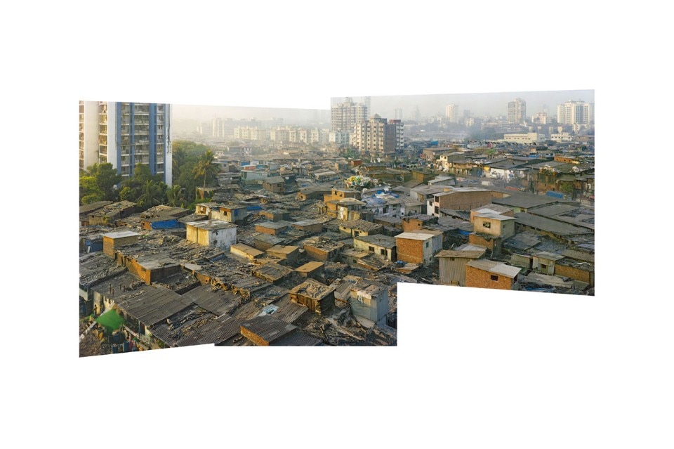 Image From photographer Robert Polidori’s series of urban cityscapes (image 5/7)
This image by Robert Polidori shows the squalor of urban city life on a mass scale. By revealing this through a special editing technique known as ‘photo-stitching’, I feel as though Polidori wants to highlight the lack of housing in parts of the world where overpopulation is a problem. Alongside the other images in the series, I believe contextually they help to accentuate this argument, which I feel could be targeted at newspaper or magazine readers of wealthier countries.
Photo-stitching is achieved when multiple images are merged together, normally in panoramic compositions, to create one big image that is larger and is usually made for gallery viewing. The idea is to inform the length and breadth of a scene for political, social or environmental purposes. Personally, I believe Polidori has accomplished this concept with his photo-stitching of the above image. He has deliberately displayed this technique with the aim of showing the extent overcrowding has on the affected area of society.
The ability to combine images is a useful post-production technique to be aware of and can improve how a scene is portrayed to the audience if done right. However, I may not use this technique in the future as it can make certain elements in my smaller prints appear unnoticeable.
Source: ZAMPONI, B. 2016. Robert Polidori; The Canadian photographer Robert Polidori talks about his recent artistic portraits: metropolises such as Amman, Mumbai and Rio de Janeiro, where urban sprawl has a spontaneous cellular structure. [online]. Domus. Available from: https://www.domusweb.it/en/interviews/2016/11/18/robert_polidori.html [Accessed 03-10-18].
HDR
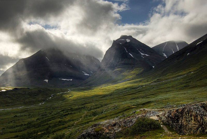
Photographer Alexandre Buisse’s Landscape image of Mount. Kebnekaise, Sweden
This image, when placed in a series of similar images, depicts a scene that is advertisement for mountain trails. The photographer Alexander Buisse has conveyed to the audience the intimidating nature and height of these mountains and has formed the sense of danger that has become associated with them.
Buisse has used HDR; a technique of blending which involves layering images on top of each other to create a wide dynamic range file when completed. When done correctly, as Buisse has, the resulting image looks and feels more atmospheric and has more impact with the contrast that is visible. It can also improve the quality of the light in a scene. With the above image, multiple exposures have been taken and combined to show all the colours on the mountains to their fullest extent.
The HDR technique has been used well by Buisse to dramatise the mountains in the scene and is not overdone like most internet examples. I would like to pursue this technique when it comes to shooting for my environment brief as any landscapes that I choose to do will be eye catching on print.
Source: REICHMANN, M. 2011. HDR Plea [online]. Luminous Landscape. Available from: https://luminous-landscape.com/hdr-plea/ [Accessed 03-10-18].
Frequency separation

Fashion portrait from Photographer Katherine Calnan’s ‘Model Portfolio’ advertisement
This image by photographer Katherine Calnan depicts studio portraiture that effectively shows the movement of the model and depicts what appears to be dancing. Contextually, I believe that this image is designed to express fashion in a magazine like Vogue or Marie Claire.
This image uses frequency separation, a form of softening that blurs the skin textures on selected areas of someone’s face to accentuate a certain appearance. It is an editing technique that photographers apply to women as it helps to make them look more feminine. It is used, in this image’s case, to emphasise the black and white tones and supply a sense of smoothness of the model’s skin to complement the dancing aspect of it. The contrast Calnan has created is effective in showing off the fashion of the image as well as the make-up, highlighting it to make it eye-catching to the viewer.
I admire the use of frequency separation in the image and feel as though it would be good to implement on all my portraits with female models in them. I believe that by doing so that my images will look more the professional and considered beauty images on the web as a result.
Source: CALNAN, K. Model portfolio session. [online]. Katherine Calnan Photography. Available from: https://katherinecalnan.com/2016mps1/ [Accessed 10-10-18].
Image blending mode compositing
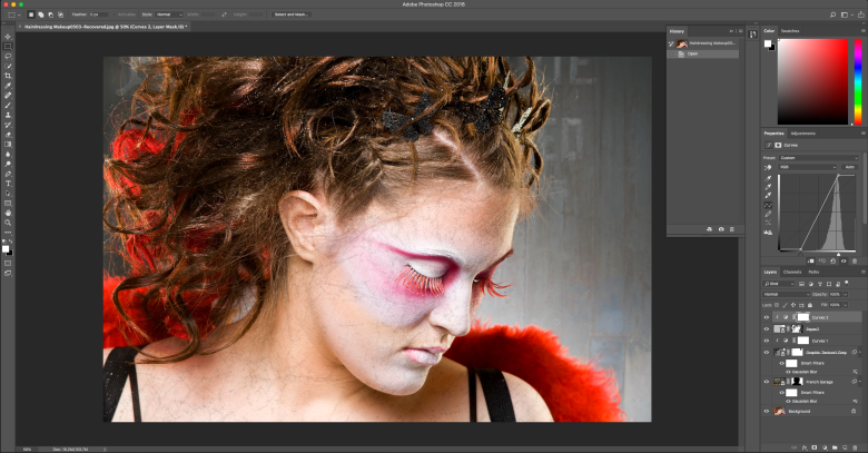
Working example screenshot using test image(s)
This screenshot is an editing process I have done as part of a class tutorial involving layering and masking multiple images together to create a composite in Adobe Photoshop. This is useful for layering specific visual effects and textures onto, or to drop a background into, a studio portrait with ease. The market for images that need this technique are for agencies who want to have believable product advertisements and fashion posters. It can also be targeted at galleries wanting to express fine art and landscape photography.
The ability to blend several shots together is a good and useful skill to know to be adaptable to clients’ needs and wants. In terms of fashion photography (as an example), it would be beneficial to use this technique if the photographer is on a strict timescale and cannot get their model out on location for a shoot. With the technique, the photographer would then only have to worry about the lighting of the scene and where the model would be positioned afterwards. The technique is performed by changing the blend mode of an image file that has been dropped and dragged onto another image to one of three main options: multiply, screen or overlay. ‘Multiply’ removes white from an image, ‘screen’ removes black from an image and ‘overlay’ uses both white and black to create contrast on the light and dark elements of the base image. Once set, areas of the image will be masked out with the brush tool so that the main model/subject of the image is distinguishable.
Regarding my own post-production, I might implement this technique into one of the images I will edit for brief submission. I will need to have good practice with the technique as I have only used it once before to show texture layering on one of my finals for last year’s HN1 image editing task. If I choose to do so, I may try out some of the other blend modes that are also available to see if any of them supply better results.
Colour channel sharpening
Christopher Swift’s video tutorial on the method of sharpening images using an image’s colour channels
For this technique, sharpening is only applied to areas where sharpening is necessary by using the ‘channels’ panel in Adobe Photoshop. In terms of a target audience, this technique is very flexible, being able to be used with any image, whether it be for a fashion, documentary or environmental image. It is particularly effective when practiced in conjunction with images that feature strong, bold colours to distinguish a contrast that is subtle but noticeable. It is done at the end of the post-production workflow to not damage the underlying pixels on the other layers of an image.
The technique itself, is very precise, allowing the user to have the freedom to choose what parts of an image are to be sharp and what parts are to be left untouched. In the video, Swift takes a more direct approach to sharpening his image; opting more to select colour channels and applying sharpening without much refinement to show the basics of the technique to his YouTube audience. Because of this, I have decided to analyse a more in-depth form of this sharpening to that of which I learnt in one of my editing classes. The way it is used involves going to the channels and picking which colour (blue, green or red) is needed for sharpening. By a control and click, marching ants appear around colour tones singled out by the choice of channel. This is then inverted so that the opposite is selected, and an un-sharp mask filter is added for the sharpening effect to be generated. The marching ants are then deactivated, with the layer style window finally is opened to access and adjust the ‘blend if’ control toggles. This helps to specify the range of the sharpening, so that no noise from the filter is added to the dark areas of an image. As a completed process, I find that the technique would be best performed as an action for the user to use when needed.
For my images, I want to feature this way of sharpening to make eye-catching results that I know are being made through non-destructive technique means. As a set of actions that I created during the advanced image editing class at college, I will try to use it where I can on all the images I produce for this brief as an automatic thing I do.
Source: Swift, C. 2012. Sharpening: Using Colour Channels. [online video]. YouTube. Available from: https://www.youtube.com/watch?v=OAOp6YWDoNU [Accessed 21-10-18].
Content aware fill
The Photoshop Training Channel’s video tutorial on the advanced method of removing unwanted elements from an image
I have chosen this video as it describes a recently implemented feature in Adobe Photoshop that involves spot fixing an image. Rather than the simple but unreliable lasso select method being used to erase blemishes and distractions from a scene, the content aware fill window allows the user a range of different blending preferences to get an exact removal. This tool of post-production will be standard for photographers who want clean, attractive images easily. I feel as though this video is directed at such photographers or editors who want to know how this new image editing technique works and how it could help them.
The presenter of the video itself, Jesús Ramirez, clarifies how the content aware fill tool works and what each of the preview panes does to contribute to the operation of this. Personally, I find Ramirez‘s step-by-step explanation of the tool to be adequate to the extent that it has a balance of being easy to understand and interesting at the same time. I like the fact that he went in depth enough to show the effect that every choice played on the example images and that results would vary depending on which one you picked.
If any of my images have any noticeably large distractions or blemishes in them, I would think that the use of the content aware fill tool will be good to include in my workflow. Up till the introduction of this tool, I have had to spend a lot of time fixing parts of images I found a nuisance and I believe that this tool will be fundamental for me to be quicker working as a result.
Source: Photoshop Training Channel. 2018. How to Use the NEW Content-Aware Fill in Photoshop CC 2019 – MUST-KNOW New Feature. [online video]. YouTube. Available from: https://www.youtube.com/watch?v=_uufErqO544 [Accessed 21-10-18].
Double exposure

Nude fine art portrait by photographer Daniel Araiza as part of his series of a similar nature titled “Elements”
Photographer Daniel Araiza has created a very captivating image (and series) that is made up of several images distinctly chosen so to stress a meaningful message to the viewer. Symbolically, he has displayed a concern for a breakdown of boundaries, portraying the model, who is nude, as a defenceless soul. Even though Araiza’s project is characterised as an exploration and deconstruction of the human form, I would argue that his images have a much deeper implication when faced with an audience. I believe that these images are to highlight the psychological effect sexual violence has on a person.
With the above example from the series I have chosen, I like the double exposure effect Araiza has employed on the image. This technique’s purpose is usually always to reveal the thought or mentality of a model. It is also sometimes used to show the movement of them. I like how he has overlaid two images together: one image of the model and one of old wood, or a relatable substance, to shape the outcome. Furthermore, Araiza has emphasised the context of the shoot by displaying black and white tones with a charcoal-like haze to depict deterioration. I admire the way the double exposure’s effect on the image forms an illusion to look almost realistic to the eye.
In my attempts, I may have a retry at this technique as I really enjoy the inventiveness that a double exposure can provide. It would be visually appealing, but it would also have to need a strong story element for it to make sense to the viewer if I do so again.
Source: ARAIZA, D. 2017. Elements. [online]. fstoppers. Available from: https://fstoppers.com/groups/10608/nude-art-photography/173285/elements [Accessed 21-10-18].
Selective colour adjustment

Photographer Blake Jackson’s portrait of a girl from his collection of similarly styled images
Though referencing colour grading, this image by photographer Blake Jackson also shows a concern for brightly lit vibrant colours. Contextually, this image, I feel, would be suited in a fashion magazine with a target market for people who are eager to buy clothes like the ones the model is wearing.
Jackson appears to have performed selective colour adjustments to make individual tones in his image stick out. This is clear on the hat and make-up; deliberately highlighting them to make the model eye-catching and, in turn, so too the apparel. Likewise, I appreciate the complementary green and red tones used to help distinguish her from the rest of the scene. I believe that Jackson has used the lasso tool in Adobe Photoshop to select the areas that needed a colour boost before adjusting them with the hue/saturation sliders and curves adjustment layer to lift them from the background.
I will consider this method of illuminating colours as a possibility for my own images. In general, I do not feel as though I have much problem with separating a model or subject from their background, but I would however like to know this technique for future edits that may need a bit colour in my fashion and photojournalism shoots.
Source: PHOTOGRIST. 2017. Vibrant and Cinematic Portrait Photography by Blake Jackson. [online]. Photogrist Photo Magazine. Available from: https://photogrist.com/vibrant-cinematic-blake-jackson/ [Accessed 21-10-18].
Liquify
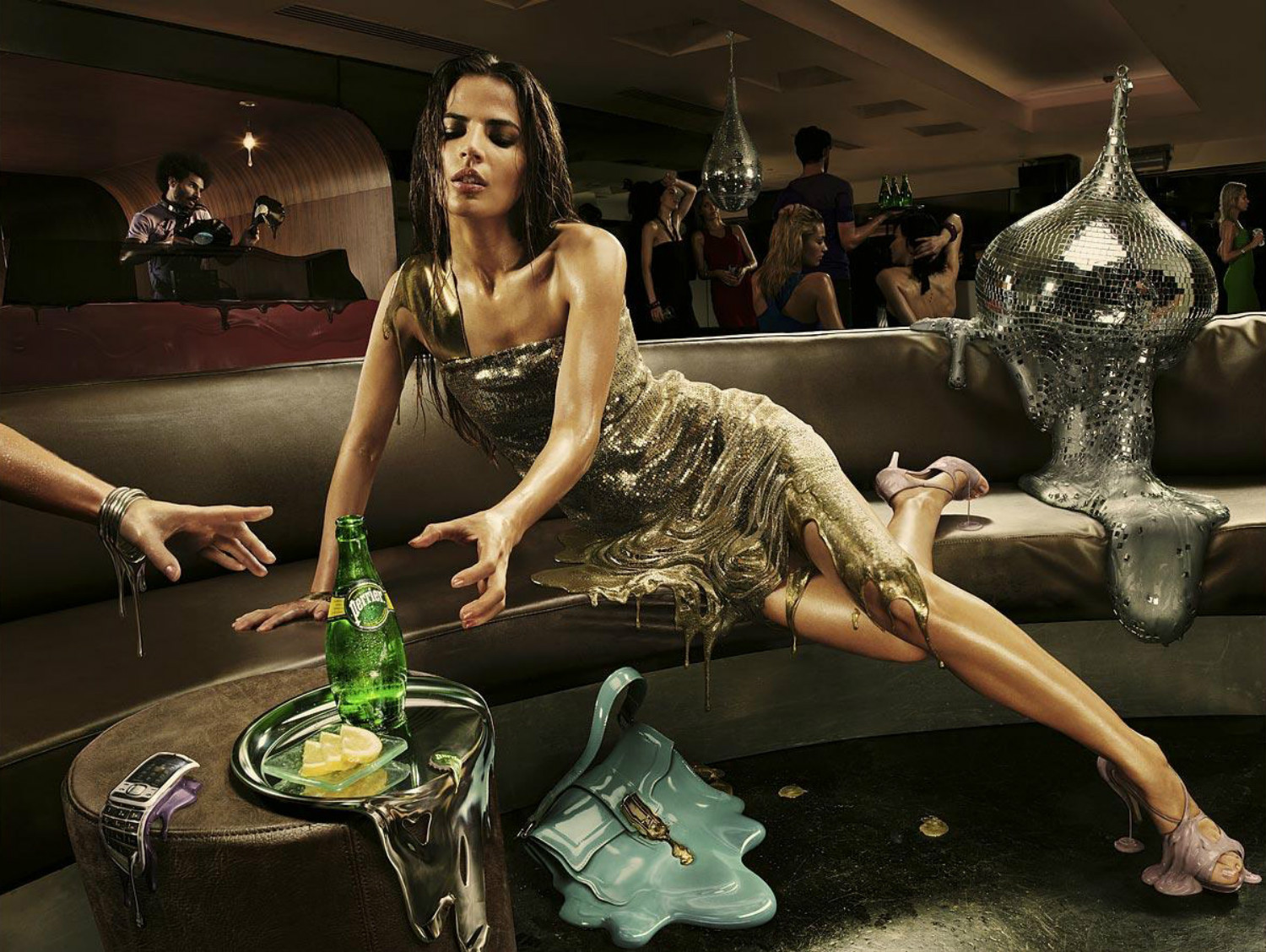
Environmental portrait depicting a ‘melting’ model by photographer Christophe Huet
As a concept, this stylised image by photographer Christophe Huet hints at the state of mind many people get into when they are drunk at a party. The image reveals the vision of a life where everything appears to be dissolving right before one’s eyes and with a certain element of haste. I think the target market for this image is for advertisement purposes, either to promote the type of drink shown or to discuss alcohol awareness amongst young adults.
The magic of this image comes from the liquify tool in Adobe Photoshop. I believe Huet has done an excellent job at showing off the full capabilities of the tool when editing; capturing the melting aspects of the dress and the disco ball to appear like pools of lava flowing over the model and the seat. I also admire the effort Huet put in to the image to make sure the light was right on each of the elements to show realism to the viewer. In addition, I like how with these parts of the image create a sense of heat to reveal the atmosphere that a party or nightclub presents. I find that this is further accentuated by the model’s hair appearing to be soaked with sweat.
Overall, I feel that the liquify tool, as an advanced image editing feature, can be a powerful creative asset when performed correctly on an image and used within reason and context for the target audience. However, in terms of the brief, I may choose to not use this tool on my images as it is complicated to get right and not look too fake.
Source: SMAIL, C. 2015. Great artists have been manipulating their canvases in surreal and exciting ways for hundreds of years. You only need to look back to the distorted visions dreamed up by Magritte and Dali to see that. [online]. Scene 360 Magazine. Available from: https://scene360.com/art/78011/surreal-photo-manipulations/ [Accessed: 21-10-18].
